Thumbnail Analysis
See how this YouTube thumbnail performed on our AI analyzer
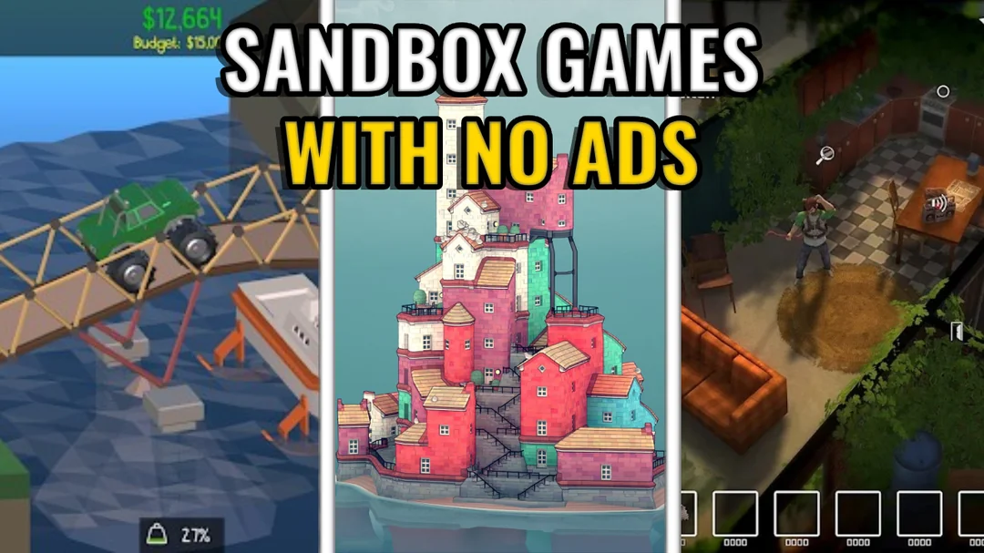
Analysis Summary
This thumbnail effectively communicates a strong value proposition ('no ads') through clear text, which is its primary strength. However, the small, busy game screenshots hinder visual impact and clarity, especially on mobile. Emotional connection is also absent due to the lack of faces or dramatically compelling game visuals.
Functional but lacks a distinct viral hook; follows standard list video patterns without unique visual flair.
The 3-panel layout is a common pattern for 'top X games' videos, making it recognizable but not particularly unique or disruptive. The bright yellow text on a black outline provides good contrast, which helps visibility. However, there are no 'WTF' moments or easily shareable/meme-worthy elements. To improve, consider incorporating a single, highly dramatic or aspirational screenshot from one of the games, or adding a specific visual element that plays on the 'no ads' concept in a more creative way (e.g., an 'ad-block' icon over a generic ad).
Powered by Thumblr — AI-powered thumbnail optimization